


There are many tools available for data visualization, but some require a significant amount of coding to create even a basic graph. This can take away from the time that could be spent analyzing the data itself.
Imagine if there were a tool that could make data exploration easier for users by suggesting useful visualizations. The town has a brand-new library called Lux that was created specifically to answer these queries.
Current obstacles to effective data exploration
There are several challenges that data analysts face when trying to explore data and find insights. One of the biggest challenges is going from a question in our minds to discovering actionable insights. Another challenge is finding the right tools for data exploration. While interactive Jupyter notebooks enable iterative experimentation, powerful BI tools like Power BI and Tableau enable advanced exploration with a mere point and click.
The gap between code and interactive tools While programming tools offer a high degree of customization, they can be difficult to use for those with less programming experience. On the other hand, point and click tools are much simpler to use, but offer less flexibility.
Plotting takes a lot of code and planning

We also need to think about what the visualization would look like with all the specifications and translate all these specification details into code. The figure above shows how a substantial amount of code is required in two popular Python libraries—Matplotlib and Plotly—just to output a mere bar graph. This affects data exploration, especially when users only have a vague idea of what they are looking for.
- Trial and error is time-consuming and exhausting
Trial and error is a common and essential part of any EDA process. Experimenting with multiple visualizations is often necessary before finding the most effective one for the data set. It is also easy to miss important insights that are present in the data during this process. Furthermore, analysts may not always know which set of operations to perform on their data in order to arrive at the desired results, and may consequently get lost or stuck during their analysis.
Lux
Lux aims to make data exploration more accessible by automating various aspects of the process. It features an intent language that allows users to express their analysis goals less precisely, and it automatically fills in the missing details and determines appropriate visualization mappings.
- Lux bridges the gap between code and interactive interfaces by bringing the power of interactive visualizations directly into Jupyter notebooks.
- Lux includes a powerful intent language that allows users to specify their analysis interests in order to reduce programming costs.
- Lux automatically recommends visualizations of data frames to users.
Now that we have a good understanding of Lux’s approach to solving the common issues users encounter when exploring data, let’s look at an example of how we can use the Lux library. We will use a very straightforward example since the goal is to just give a brief demonstration. Once we have a decent understanding, we can apply it to the dataset of our choice.
Case Study: Analyzing the Iris dataset
The Iris dataset consists of data on three different species of Iris flowers: Iris Setosa, Iris Virginica, and Iris versicolor. The data includes measurements of the sepal length and width, and the petal length and width for each flower. Let’s start by installing and importing the Lux library.
Installation
Importing the necessary libraries and the dataset
We will import the Lux library along with our dataset once it’s been installed.
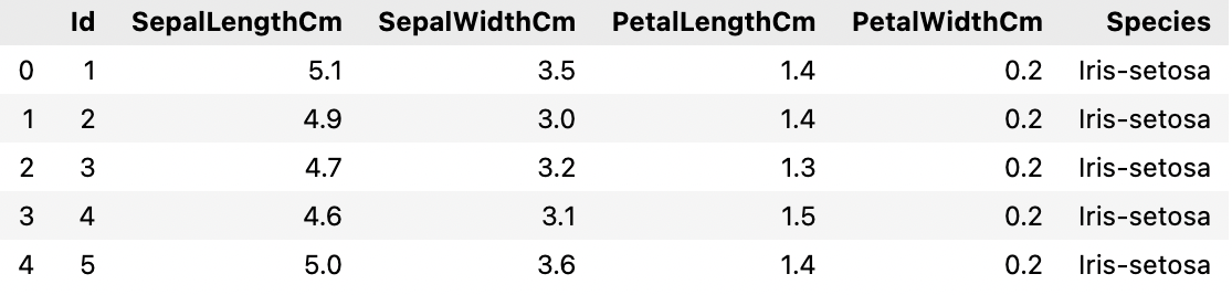
Lux’s advantage is that it can be used directly with the pandas dataframe and does not require any changes to the existing syntax. If we remove a column or row, for example, the recommendations are regenerated using the updated dataframe. All of the best pandas features, such as dropping columns and importing CSVs, are also preserved. Let’s take a look at the data set as a whole.

Our data is now in memory, and we are all set to see how Lux can ease the EDA process for us.
EDA with Lux:
We see the default pandas table display when we print the data frame. To get a set of recommendations generated automatically by Lux, we can toggle it.

Lux’s recommendations are organized into three tabs that represent potential next steps that users can take in their exploration.
The Correlation Tab displays a set of pairwise relationships between quantitative attributes, ranked from most correlated to least correlated.

The Distribution Tab displays a collection of univariate distributions ranked from most skewed to least skewed.

The Occurrence Tab displays a collection of bar charts that can be created using the data set.

This tab shows there are three different species of Iris — Setosa, Versicolor, and Virginica.
Intent-based recommendations
We can specify our analysis intent in addition to the basic recommendations. Assume we want to know how the length of the sepals varies between species. Here, we can specify the intent as [‘SepalLengthCm’,‘Species’]. We can see that the recommendations are steered to what is relevant to the intent that we’ve specified when we print out the data frame again.
The image below shows Current Visualization corresponding to the attributes that we have selected on the left-hand side. On the right, we have Enhance, which describes what happens when we add an attribute to the current selection. The Filter tab, which adds filters while fixing the selected variable, is also available.


Exporting visualizations from Widget
Lux also makes it simple to export and share the visualizations that are created. The visualizations can be exported as static HTML using the following syntax:
The properties recommendation also provides access to the set of recommendations generated for the data frames. The end result is a dictionary with the key being the name of the recommendation category.
Conclusion: In the above article, we saw how Lux could completely transform a data analysis workflow in a Jupyter notebook. Lux provides significantly more visual richness to encourage meaningful data exploration. Lux is still in active development, and its maintainers are eager to hear from users who are using or are considering using it. This will assist the team in determining how they can improve the tool for us.
If you too are interested in learning more about Python programming and acquire a certificate in Data Science, enroll for our Full Stack Data Science program that offers 100% placement guarantee.
Read our most recent blog on “The Bayes’ Theorem Made Simple”.


