


Every successful web developer starts with simple building blocks. HTML and CSS are not just markup and styling languages; they are the foundation of how the web looks, feels, and communicates with users. For beginners, projects are the most effective way to understand how structure, layout, and design principles work together in real-world scenarios. Rather than memorizing tags or properties, building projects helps you think like a developer, solve layout problems, and develop confidence. This article presents carefully chosen beginner-friendly projects that progressively strengthen your understanding of HTML and CSS while preparing you for more advanced front-end technologies.
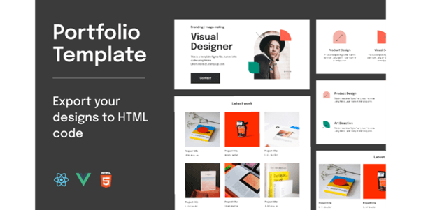
Personal Portfolio Website
Purpose and Structure
Importance of a Portfolio for Beginners
Explanation
A personal portfolio website serves as a beginner’s digital identity and professional showcase. It allows learners to present their skills, projects, and background in a structured and visually clear manner. Building a portfolio helps beginners understand how real websites are organized and how information flows from one section to another. It also encourages clean coding practices and thoughtful design decisions. For recruiters and mentors, a portfolio demonstrates seriousness, consistency, and learning progress.
Table
| Section Name | Content Included | HTML Element | Purpose |
|---|---|---|---|
| Header | Name, navigation | <header> | Branding and navigation |
| About | Introduction | <section> | Personal overview |
| Projects | Work samples | <section> | Skill demonstration |
| Skills | Technologies | <section> | Technical strengths |
| Contact | Email, links | <footer> | Communication |
Example
A beginner creates a portfolio website that includes a short introduction, a list of projects, and contact details. Each section is clearly separated and easy to navigate. Over time, the portfolio is updated with new projects, showing learning progress. This makes the website a living record of growth and improvement.
Use Cases
• Internship applications
• Personal branding website
• Freelance introductions
• Academic project showcase
Core Sections of a Portfolio Website
Explanation
Dividing a portfolio into clear sections improves readability and usability. Each section focuses on a specific type of information, helping visitors understand the content quickly. Beginners learn how to group related content logically using semantic HTML. Proper sectioning also improves accessibility and search engine understanding. This structure makes future updates and redesigns much easier.
Table
| Section | Description | HTML Tag | Importance |
|---|---|---|---|
| Header | Top navigation | <header> | First impression |
| About | Background info | <section> | Personal context |
| Projects | Work samples | <section> | Skill proof |
| Skills | Technologies used | <section> | Technical clarity |
| Footer | Contact details | <footer> | User connection |
Example
A portfolio homepage begins with a header showing the developer’s name. Below it, the about section introduces background and interests. Projects are displayed next, followed by skills and contact details. This logical order makes the website easy to understand and navigate.
Use Cases
• Clear content organization
• Improved accessibility
• Better user navigation
• Professional presentation
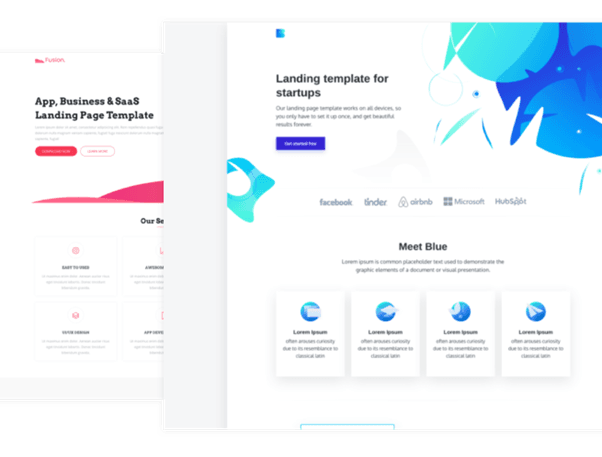
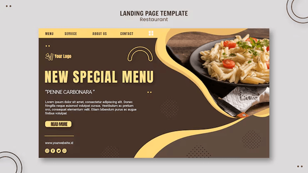
Landing Page for a Product or Service
Layout Planning
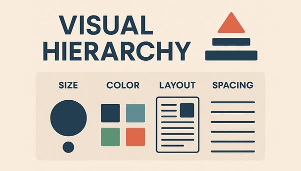
Visual Hierarchy and Content Flow
Explanation
Visual hierarchy determines how users perceive and consume information on a landing page. In a product or service landing page, users should immediately understand the main value proposition without confusion. Beginners learn how size, spacing, color, and positioning influence user attention. Headings should attract focus first, followed by supporting text and action elements. Proper content flow ensures users move naturally from understanding the product to taking action.
Table
| Page Element | Visual Priority | Purpose | Typical Styling |
|---|---|---|---|
| Main Heading | Very High | Core message | Large font, bold |
| Subheading | High | Supporting detail | Medium font |
| CTA Button | High | User action | Bright color |
| Feature Text | Medium | Product info | Normal font |
| Footer Text | Low | Secondary info | Small font |
Example
A beginner designs a landing page for a fitness app where the headline immediately communicates the main benefit. Below it, a short description explains how the app works. A prominent call-to-action button invites users to sign up. Supporting information appears further down the page, maintaining a smooth and logical flow.
Use Cases
• Product launch pages
• Marketing campaign pages
• Lead generation websites
• Startup service promotions
Section-Based Page Design
Explanation
Section-based design divides a landing page into clear, purposeful blocks of content. Each section focuses on a single idea, making the page easier to scan and understand. Beginners learn how breaking information into sections improves clarity and user engagement. Common sections include hero, features, testimonials, pricing, and call-to-action. This approach also improves maintainability and scalability.
Table
| Section Name | Content Focus | HTML Element | User Benefit |
|---|---|---|---|
| Hero | Main message | <section> | Immediate clarity |
| Features | Product benefits | <section> | Value understanding |
| Testimonials | User feedback | <section> | Trust building |
| Pricing | Cost details | <section> | Decision support |
| CTA | Final action | <section> | Conversion |
Example
A beginner builds a landing page for an online course platform. The hero section introduces the course, followed by a features section explaining learning outcomes. Testimonials build credibility, and a pricing section helps users decide. The final section encourages enrollment clearly and confidently.
Use Cases
• Structured storytelling
• Improved readability
• Higher conversion rates
• Easier content updates
Restaurant Website
Website Structure and Navigation
Essential Pages and Navigation Flow
Explanation
A restaurant website must deliver key information quickly because users often visit with a specific intent such as viewing the menu or finding the location. This project helps beginners understand how to structure a multi-page website with logical navigation. Clear navigation ensures users can move between pages without confusion. It also introduces the importance of consistent layout across pages. Learning this builds strong fundamentals in real-world website planning.
Table
| Page Name | Primary Content | HTML Elements Used | User Purpose |
|---|---|---|---|
| Home | Overview, highlights | <header>, <section> | First impression |
| Menu | Food items, prices | <section>, <table> | Browse offerings |
| About | Restaurant story | <section> | Build trust |
| Contact | Address, phone | <footer> | Reach restaurant |
| Gallery | Food images | <section> | Visual appeal |
Example
A beginner creates a restaurant website with a navigation bar linking Home, Menu, About, and Contact pages. Each page follows a similar layout for consistency. Users can easily switch between pages without losing context. This improves usability and gives the website a professional feel.
Use Cases
• Local restaurant websites
• Café and food truck pages
• Hotel dining sections
• Catering service websites
Menu Representation Using HTML and CSS
Explanation
Presenting a restaurant menu digitally requires clarity and proper alignment. This concept teaches beginners how to display structured data such as dish names, descriptions, and prices. Using tables or styled lists ensures information is easy to read. Consistent spacing and typography improve visual balance. This also introduces beginners to content-heavy layouts.
Table
| Dish Name | Category | Description | Price |
|---|---|---|---|
| Margherita Pizza | Main Course | Classic cheese pizza | ₹299 |
| Veg Burger | Snacks | Grilled veggie patty | ₹199 |
| Pasta Alfredo | Main Course | Creamy white sauce | ₹349 |
| Caesar Salad | Starters | Fresh lettuce & dressing | ₹249 |
| Chocolate Brownie | Dessert | Served with ice cream | ₹199 |
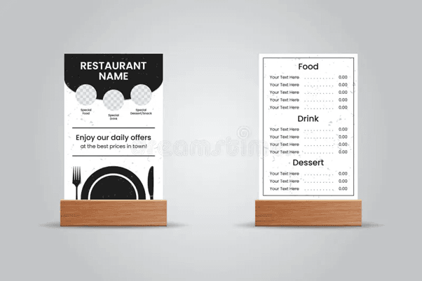
Example
A beginner designs the menu page using a table to align dish names and prices neatly. Categories are clearly labeled, making scanning easy. The menu looks clean and organized across devices. Customers can quickly decide what to order.
Use Cases
• Digital restaurant menus
• Online ordering previews
• Event catering menus
• Hotel room-service pages
Blog Website
Content Organization and Readability
Blog Layout and Post Structure
Explanation
A blog website is primarily content-driven, so clarity and structure are critical. This project helps beginners understand how to organize long-form content using logical sections, headings, and semantic elements. Proper post structure improves readability and allows users to scan content efficiently. It also introduces best practices for writing maintainable HTML that supports accessibility. Consistent layouts across posts create a professional and trustworthy reading experience.
Table
| Element | Purpose | HTML Tag | Impact on Readability |
|---|---|---|---|
| Post Wrapper | Contains one article | <article> | Logical grouping |
| Title | Main heading | <h1> | Immediate context |
| Subheadings | Content division | <h2>, <h3> | Easy scanning |
| Body Text | Main content | <p> | Continuous reading |
| Meta Info | Date/author | <time> | Content context |
Example
A beginner creates a blog page where each post is wrapped in an article element. The title appears at the top, followed by the date and structured sections. Subheadings divide the content into readable blocks. This structure makes long articles easier to follow and understand.
Use Cases
• Personal blogging platforms
• Technical documentation blogs
• Educational writing websites
• Company knowledge bases
Styling for Readability Using CSS
Explanation
Styling directly affects how comfortable users feel while reading blog content. This concept teaches beginners how typography, spacing, and layout width influence readability. Proper line height reduces eye strain, while controlled content width prevents text from becoming overwhelming. Consistent styling across posts enhances visual harmony. These decisions help retain readers for longer durations.
Table
| Element | Purpose | HTML Tag | Impact on Readability |
|---|---|---|---|
| Post Wrapper | Contains one article | <article> | Logical grouping |
| Title | Main heading | <h1> | Immediate context |
| Subheadings | Content division | <h2>, <h3> | Easy scanning |
| Body Text | Main content | <p> | Continuous reading |
| Meta Info | Date/author | <time> | Content context |
Example
A beginner applies a clean font, increases line spacing, and limits text width. The content becomes easier to read on both desktop and mobile screens. Readers can scroll comfortably without feeling overwhelmed by dense text.
Use Cases
• Improved reader retention
• Accessible content presentation
• Professional blog appearance
• Better mobile reading experience
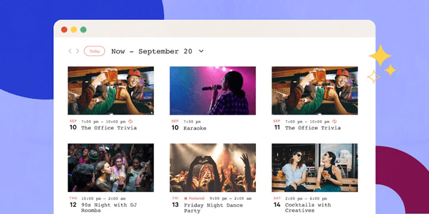
Event or Conference Website
Information Presentation and Scheduling
Event Details and Schedule Layout
Explanation
An event or conference website must clearly present critical information such as date, time, venue, and agenda. This project helps beginners learn how to organize time-based information in a structured and readable format. Proper scheduling layout ensures attendees can quickly understand the flow of the event. It also introduces alignment, grouping, and consistency across sections. Clear presentation reduces confusion and improves user trust.
Table
| Event Component | Description | Display Method | User Benefit |
|---|---|---|---|
| Event Name | Title of event | Heading | Immediate identification |
| Date & Time | Schedule duration | Text block | Planning clarity |
| Venue | Location details | Section | Easy navigation |
| Agenda | Session timeline | Table | Time management |
| Registration | Sign-up info | Button/Link | User action |
Example
A beginner designs an event website where the event name and date are prominently displayed at the top. Below this, a schedule table lists sessions with timings. Users can quickly understand when each session starts and ends. This layout makes planning attendance straightforward and efficient.
Use Cases
• Professional conferences
• College technical events
• Workshops and seminars
• Online webinars
Speaker and Session Information Display
Explanation
Speaker and session sections add credibility and help users decide whether to attend an event. This concept teaches beginners how to group related information using cards or structured sections. Presenting speaker details consistently improves visual balance and readability. It also introduces repetition and alignment in layout design. Clear session information helps users plan their participation effectively.
Table
| Speaker Name | Session Title | Time Slot | Expertise Area |
|---|---|---|---|
| Dr. A. Kumar | AI in Healthcare | 10:00–11:00 | Artificial Intelligence |
| Ms. R. Shah | Web Security | 11:15–12:00 | Cybersecurity |
| Mr. P. Mehta | Cloud Basics | 12:15–13:00 | Cloud Computing |
| Ms. N. Iyer | UX Design | 14:00–15:00 | UI/UX |
| Mr. S. Rao | DevOps Intro | 15:15–16:00 | DevOps |

Example
A beginner creates speaker cards that include names, session titles, and time slots. These cards are arranged in rows for consistency. Visitors can easily see who is speaking and what topics are covered. This builds interest and trust in the event.
Use Cases
• Speaker showcase pages
• Conference agenda displays
• Training session planning
• Event promotion websites
Simple E-Commerce Website
Product Display and Browsing
Product Listing Layout
Explanation
A product listing page is the foundation of any e-commerce website. This project helps beginners understand how to present multiple products in a clean and organized manner. Consistent layouts allow users to compare products easily and browse without confusion. Beginners learn how spacing, alignment, and repetition improve usability. This concept also introduces grid-based layouts commonly used in real-world online stores.
Table
| Product Name | Category | Price | Availability |
|---|---|---|---|
| Wireless Mouse | Accessories | ₹799 | In Stock |
| Laptop Stand | Accessories | ₹1,299 | In Stock |
| USB-C Hub | Electronics | ₹1,999 | Limited |
| Keyboard | Accessories | ₹1,499 | Out of Stock |
| Webcam | Electronics | ₹2,499 | In Stock |
Example
A beginner creates a product grid where each item is displayed in a card format. The cards include product name, price, and availability status. Users can scan products quickly and identify what they need. The layout feels clean and professional.
Use Cases
• Online product catalogs
• Small business stores
• Practice e-commerce layouts
• Product comparison pages
Product Detail Page Design
Explanation
A product detail page focuses on a single item and provides in-depth information. This concept teaches beginners how to guide user attention and present details clearly. Proper layout highlights product images, descriptions, and pricing. Consistency between listing and detail pages improves user experience. Beginners also learn how content hierarchy affects purchasing decisions.
Table
| Section | Content | Purpose | User Impact |
|---|---|---|---|
| Image Area | Product photos | Visual clarity | Better understanding |
| Title | Product name | Identification | Context setting |
| Description | Features & details | Information delivery | Decision support |
| Price | Cost value | Pricing reference | Purchase clarity |
| Action Button | Add to cart | User interaction | Conversion action |
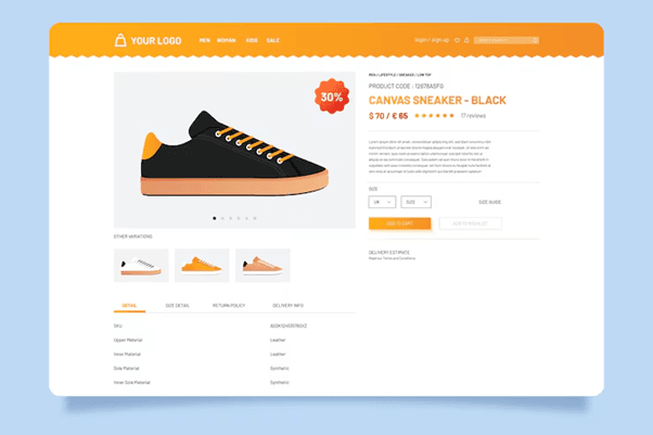
Example
A beginner designs a product detail page with a large product image at the top. Below it, the description explains key features in simple language. A clearly visible action button encourages interaction. The layout feels intuitive and easy to use.
Use Cases
• Online shopping pages
• Product marketing sites
• Retail UI practice
• Portfolio demonstrations
Photography Gallery Website
Image Presentation and Performance
Grid and Flexbox Layouts for Galleries
Explanation
A photography gallery website prioritizes visual presentation, making layout decisions especially important. This project helps beginners learn how to arrange multiple images in a structured and visually balanced way using CSS Grid or Flexbox. Proper alignment, spacing, and consistent image sizing prevent clutter and enhance focus on the photographs. Learners also understand how responsive layouts adapt the number of columns based on screen size. These skills are essential for any image-heavy website.
Table
| Layout Method | Use Case | Key Property | Benefit |
|---|---|---|---|
| CSS Grid | Uniform galleries | grid-template-columns | Structured layout |
| Flexbox | Flexible rows | flex-wrap | Responsive flow |
| Gap Control | Spacing images | gap | Visual balance |
| Aspect Ratio | Image sizing | aspect-ratio | Layout consistency |
| Media Queries | Responsiveness | @media | Device adaptability |

Example
A beginner creates a gallery page where images are displayed in a grid with equal spacing. On large screens, four images appear per row, while on smaller screens the layout adjusts to two images per row. This keeps the gallery clean and visually appealing. The images remain the main focus without overwhelming the viewer.
Use Cases
• Photography portfolios
• Art and design showcases
• Travel blogs
• Media galleries
Image Optimization and Accessibility
Explanation
Image optimization is crucial for performance and accessibility in gallery websites. Beginners learn how large image files can slow down page loading and negatively affect user experience. This concept introduces image compression, appropriate formats, and responsive image techniques. Accessibility considerations such as alternative text ensure that all users, including those using screen readers, can understand the content. These practices reflect modern web development standards.
Table
| Optimization Aspect | Technique | HTML/CSS Tool | Advantage |
|---|---|---|---|
| File Size | Compression | Image optimization tools | Faster loading speed |
| Format | JPG / WebP | <img> | Quality–size balance |
| Accessibility | Alt text | alt attribute | Screen reader support |
| Responsiveness | Scaled images | max-width: 100% | Device adaptability |
| Loading | Lazy loading | loading="lazy" | Improved performance |

Example
A beginner compresses gallery images before uploading and adds descriptive alternative text. The page loads faster even on slower networks. Users with assistive technologies can understand image context. The website feels polished and professional.
Use Cases
• Performance-focused websites
• Accessible web projects
• Mobile-friendly galleries
• Professional photography sites
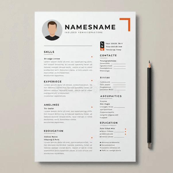
Resume Website
Professional Content Structuring
Resume Sections and Information Flow
Explanation
A resume website presents professional information in a structured and easily scannable format. This project helps beginners understand how to organize career-related data such as education, skills, experience, and achievements. Clear information flow ensures recruiters can quickly identify key strengths. Proper sectioning also improves readability and reduces cognitive load. This project reinforces the importance of clarity, hierarchy, and consistency in professional web design.
Table
| Resume Section | Content Included | HTML Element | Purpose |
|---|---|---|---|
| Header | Name and role | <header> | Identity |
| Summary | Professional overview | <section> | First impression |
| Skills | Technical abilities | <section> | Competency display |
| Experience | Work history | <section> | Practical exposure |
| Education | Academic details | <section> | Qualification proof |
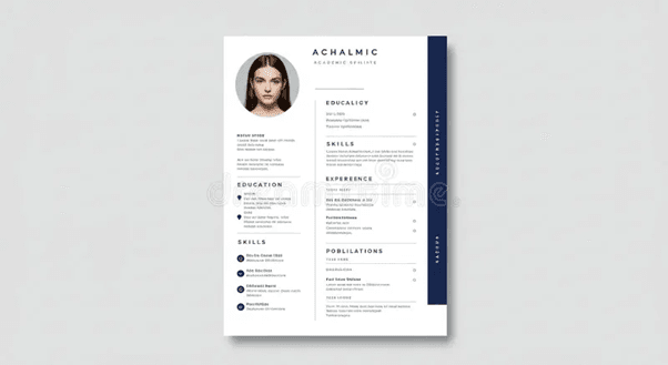
Example
A beginner creates a resume website where the name and role are clearly displayed at the top. Below it, a summary introduces professional goals. Skills and experience are presented in separate sections, making the resume easy to scan. Recruiters can quickly understand the candidate’s profile.
Use Cases
• Job applications
• Internship profiles
• Professional personal websites
• Freelance introductions
Styling for a Professional Appearance
Explanation
Styling determines how professional and trustworthy a resume website appears. This concept teaches beginners how subtle design choices influence perception. Neutral colors, clean typography, and consistent spacing help maintain seriousness. Overuse of colors or effects is avoided to keep the focus on content. This project builds an understanding of minimal and effective design.
Table
| Styling Aspect | Recommended Choice | CSS Property | Visual Effect |
|---|---|---|---|
| Color Palette | Neutral tones | color, background | Professional look |
| Font Family | Sans-serif | font-family | Improved readability |
| Spacing | Consistent gaps | margin, padding | Visual clarity |
| Headings | Clear hierarchy | font-size | Section distinction |
| Alignment | Clean layout | text-align | Orderly presentation |
Example
A beginner applies a neutral color palette with simple fonts. Headings are slightly larger than body text, and spacing is consistent throughout. The resume appears clean, modern, and professional without unnecessary decoration. This improves recruiter perception.
Use Cases
• Corporate job profiles
• Online CVs
• Portfolio–resume hybrids
• Professional networking pages
Educational Website
Learning Content Organization
Course and Lesson Structure
Explanation
An educational website must present learning material in a clear, logical, and progressive manner. This project helps beginners understand how to structure courses, modules, and lessons so that learners can navigate content without confusion. Proper organization supports step-by-step learning and reduces cognitive overload. It also introduces hierarchical structuring using headings and sections. These skills are essential for building platforms that support long-term learning.
Table
| Content Level | Description | HTML Element | Purpose |
|---|---|---|---|
| Course | Main subject | <section> | Topic grouping |
| Module | Topic group | <section> | Logical division |
| Lesson | Individual unit | <article> | Focused learning |
| Resources | Notes/links | <ul> | Supplementary help |
| Progress | Status info | <div> | User tracking |
Example
A beginner designs an educational website where courses are listed on the homepage. Clicking a course reveals modules, and each module contains lessons. This hierarchy helps learners understand where they are and what comes next. Navigation feels intuitive and structured.
Use Cases
• Online learning platforms
• Coaching institute websites
• Corporate training portals
• Skill development platforms
Readability and Visual Clarity
Explanation
Educational content requires high readability to support long study sessions. This concept teaches beginners how typography, spacing, and contrast affect comprehension. Clear headings help learners identify key sections quickly. Simple layouts minimize distractions and improve focus. These design decisions directly influence learning effectiveness.
Table
| Design Element | Recommended Practice | CSS Property | Benefit |
|---|---|---|---|
| Font Size | Medium to large | font-size | Easy reading |
| Line Spacing | Adequate gaps | line-height | Reduced strain |
| Contrast | Dark on light | color | Better visibility |
| Layout Width | Controlled | max-width | Focused content |
| Section Spacing | Consistent | margin | Improved clarity |

Example
A beginner applies larger fonts for lesson titles and increases line spacing for paragraphs. The background remains light, and text contrast is high. Learners can read comfortably for extended periods without fatigue. The content feels calm and organized.
Use Cases
• Student learning portals
• E-learning content pages
• Educational blogs
• Online documentation
Clone of a Popular Website Homepage
Layout Analysis and Replication
Breaking Down Page Sections
Explanation
Cloning a popular website homepage is a powerful learning exercise for beginners. It teaches how professional layouts are constructed using simple structural blocks. By analyzing headers, banners, content sections, and footers, learners understand real-world design patterns. This project builds confidence in handling complex layouts using only HTML and CSS. It also sharpens observation and planning skills.
Table
| Page Section | Function | HTML Element | Learning Outcome |
|---|---|---|---|
| Header | Navigation | <header> | Layout structure |
| Hero | Main focus | <section> | Visual emphasis |
| Content Blocks | Information | <section> | Repetition patterns |
| Sidebar | Supporting links | <aside> | Layout balance |
| Footer | Extra links | <footer> | Page completion |
Example
A beginner selects a well-known website and visually divides the homepage into sections. Each section is recreated step by step using HTML. This method simplifies complexity and makes large designs manageable. The learner gains confidence through systematic replication.
Use Cases
• Design analysis practice
• Frontend skill benchmarking
• Portfolio demonstration
• Layout mastery exercises
Visual Accuracy and Responsiveness
Explanation
After structure, visual accuracy ensures the clone closely resembles the original design. This concept teaches beginners how spacing, alignment, and typography affect appearance. Responsiveness ensures the layout adapts across screen sizes. Learners also understand how small CSS adjustments can significantly impact design quality. This project simulates real-world frontend refinement.
Table
| Design Aspect | Focus Area | CSS Property | Result |
|---|---|---|---|
| Spacing | Consistency | margin, padding | Clean layout |
| Alignment | Precision | flex, grid | Visual order |
| Typography | Accuracy | font-size | Realistic look |
| Responsiveness | Adaptability | @media | Multi-device support |
| Scaling | Flexibility | %, vw | Fluid design |

Example
A beginner adjusts font sizes, spacing, and alignment to closely match the original site. Media queries are added to support mobile devices. The final result looks professional and functions smoothly across screens. This builds real-world readiness.
Use Cases
• Advanced HTML/CSS practice
• Portfolio enhancement
• UI replication skills
• Preparation for frameworks
Conclusion
HTML and CSS projects form the backbone of frontend development learning. The ten projects covered in this article progressively develop structure, styling, responsiveness, and usability skills. Each project reflects real-world website requirements while remaining beginner-friendly. Completing these projects equips learners with practical experience and strong portfolio assets. This foundation prepares beginners for advanced frontend technologies and professional development paths.
Additional Readings
HTML Semantic Elements Documentation
CSS Flexbox and Grid Guides
Responsive Web Design Principles
Web Accessibility Guidelines (WCAG)
Frontend Design Best Practices
Links For AlmaBetter References:
Below is a curated list of resources from the AlmaBetter website, including cheat sheets, tutorials, and articles that directly support the concepts and projects found in their guide on "10 Best HTML and CSS Project Ideas for Beginners."
1. Essential Cheat Sheets
These quick-reference guides are invaluable when building the beginner projects mentioned in the list (such as personal portfolios, landing pages, or survey forms).
- CSS Cheat Sheet (Link found within the React/Tailwind guides): Covers selectors, box models, flexbox, and grid—essential for layout-heavy projects.
- Emmet Cheat Sheet: Helps you write HTML and CSS code much faster using abbreviations.
- Tailwind CSS Cheat Sheet: Useful if you want to skip traditional CSS and use a utility-first framework for your projects.
2. Step-by-Step Tutorials
These tutorials provide the foundational knowledge required to structure and style your first few projects.
- HTML5 Document Structure: A deep dive into the mandatory tags needed for any web project.
- Setting up HTML5 Development Environment: Explains how to set up VS Code and live servers before you start your first project.
- Create Views and Templates: While focused on Django, this tutorial explains how HTML and CSS work together to create "templates" for websites.
3. Relevant Articles & Project Guides
These articles offer theoretical context and additional project inspiration for beginners.
- How to Become a Front End Developer (Step-by-Step): Outlines the learning path from HTML/CSS to advanced frameworks.
- Power of Semantic HTML and ARIA: Crucial for making your projects (like a "Survey Form" or "Tribute Page") accessible and professional.
- Tailwind CSS vs. Bootstrap: Helps you decide which styling framework to use for more complex beginner projects.
- Advantages and Disadvantages of CSS: A fundamental read on why CSS is used for separation of concerns in web design.
- What is CodePen?: A guide on using CodePen, which is the most popular platform for hosting and sharing beginner HTML/CSS projects.
4. Advanced Project Inspiration
If you finish the 10 beginner projects, AlmaBetter also provides a list for the next level:
- 15 Backend Project Ideas to Enhance Your Portfolio: Includes a "To-Do App" guide which is the perfect transition from pure HTML/CSS to JavaScript and Backend.


 in Bengaluru, India
 in Bengaluru, India