


Data visualization is a powerful tool that allows us to gain insights and communicate information in a more accessible and engaging way. One of the popular libraries for creating visualizations is Matplotlib. In this blog, we'll explore how to use Matplotlib to create a range of visualizations.
Getting Started with Matplotlib
Before we dive into specific visualizations, let's first explore how to get started with Matplotlib. First, you need to install it using pip:
pip install matplotlib
Once installed, you can import it in your code:
import matplotlib.pyplot as plt
Now let's start exploring some visualizations.
Line Chart
A line chart displays data points in a series over time. It is helpful to understand trends and patterns in the data. In Matplotlib, we can use plot() function to create a line chart. We provide x-values and y-values to the function as input parameters. We can add labels and title to the chart using xlabel(), ylabel(), and title() functions.
A line chart is a useful visualization for showing trends over time. Let's start with a simple example:
import matplotlib.pyplot as plt

# Sample data

x = [1, 2, 3, 4, 5]

y = [2, 4, 6, 8, 10]

# Create the line chart

plt.plot(x, y)

# Add labels and title

plt.xlabel('X-axis label')

plt.ylabel('Y-axis label')

plt.title('Line Chart Example')

# Show the chart
plt.show()
The above code will create a line chart with x-values on the x-axis and y-values on the y-axis.
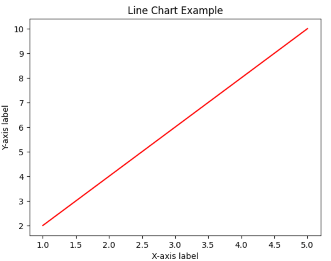
Line chart of above code
Bar Chart
A bar chart is used for comparing values across different categories. It displays data points as rectangular bars, where the length of each bar is proportional to the value it represents. In Matplotlib, we can create a bar chart using the bar() function. We provide labels and values to the function as input parameters. We can add labels and titles to the chart using xlabel(), label(), and title() functions.
A bar chart is used for comparing values across different categories. Here's an example:
import matplotlib.pyplot as plt

# Sample data

labels = ['A', 'B', 'C', 'D', 'E']

values = [10, 25, 5, 15, 20]

# Create the bar chart

plt.bar(labels, values)

# Add labels and title

plt.xlabel('Categories')

plt.ylabel('Values')

plt.title('Bar Chart Example')

# Show the chart

plt.show()
This code will create a bar chart with categories on the x-axis and values on the y-axis.
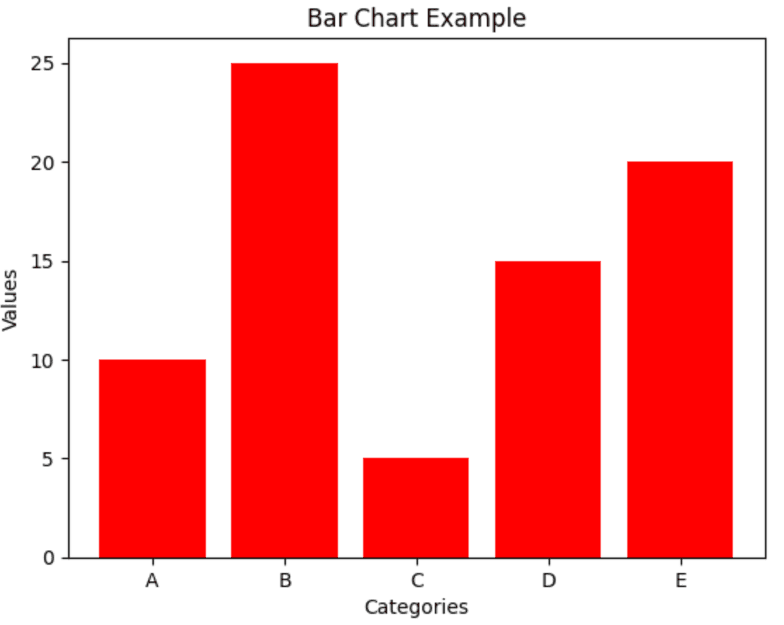
Bar graph of above code
Histogram
A histogram displays the distribution of a continuous variable. It is a graph that shows the number of observations that fall within certain ranges, called bins. In Matplotlib, we can use hist() function to create a histogram. We provide the data and the number of bins as input parameters. We can add labels and title to the chart using xlabel(), ylabel(), and title() functions.
A histogram is useful for showing the distribution of a continuous variable. Here's an example:
import matplotlib.pyplot as plt

import numpy as np

# Generate random data

data = np.random.normal(0, 1, 1000)

# Create the histogram

plt.hist(data, bins=30)

# Add labels and title

plt.xlabel('Values')

plt.ylabel('Frequency')

plt.title('Histogram Example')

# Show the chart

plt.show()
This code will create a histogram with values on the x-axis and frequency on the y-axis.
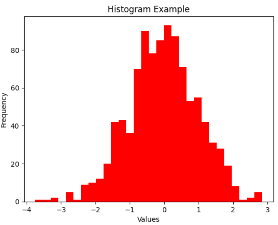
Histogram of above code
Scatter Plot
A scatter plot is used for displaying the relationship between two continuous variables. It shows how one variable is affected by another. In Matplotlib, we can create a scatter plot using the scatter() function. We provide x-values and y-values to the function as input parameters. We can add labels and titles to the chart using xlabel(), ylabel(), and title() functions.
A scatter plot is useful while showing the relationship between two continuous variables. Here's an example:
import matplotlib.pyplot as plt

import numpy as np

# Generate random data

x = np.random.normal(0, 1, 100)

y = np.random.normal(0, 1, 100)

# Create the scatter plot

plt.scatter(x, y)

# Add labels and title

plt.xlabel('X-values')

plt.ylabel('Y-values')

plt.title('Scatter Plot Example')

# Show the chart

plt.show()
This code will create a scatter plot with x-values on the x-axis and y-values on the y-axis.
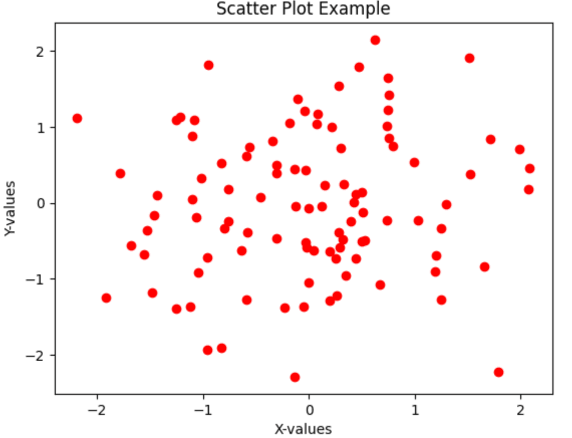
Scatter plot of above code
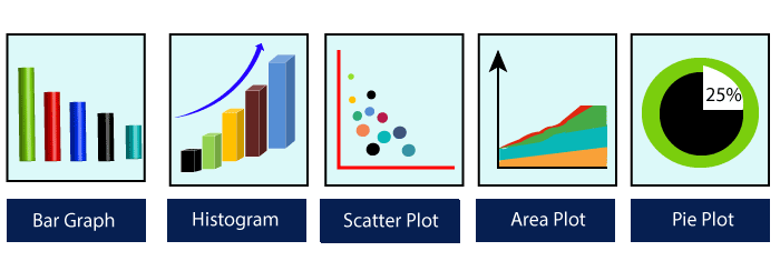
In addition to these basic visualizations, Matplotlib provides several other visualizations like pie chart, area chart, box plot, and heat maps. We can customize the visualizations by changing the color, style, and size of the plots, adding legends and annotations, and adjusting the axis and grid.
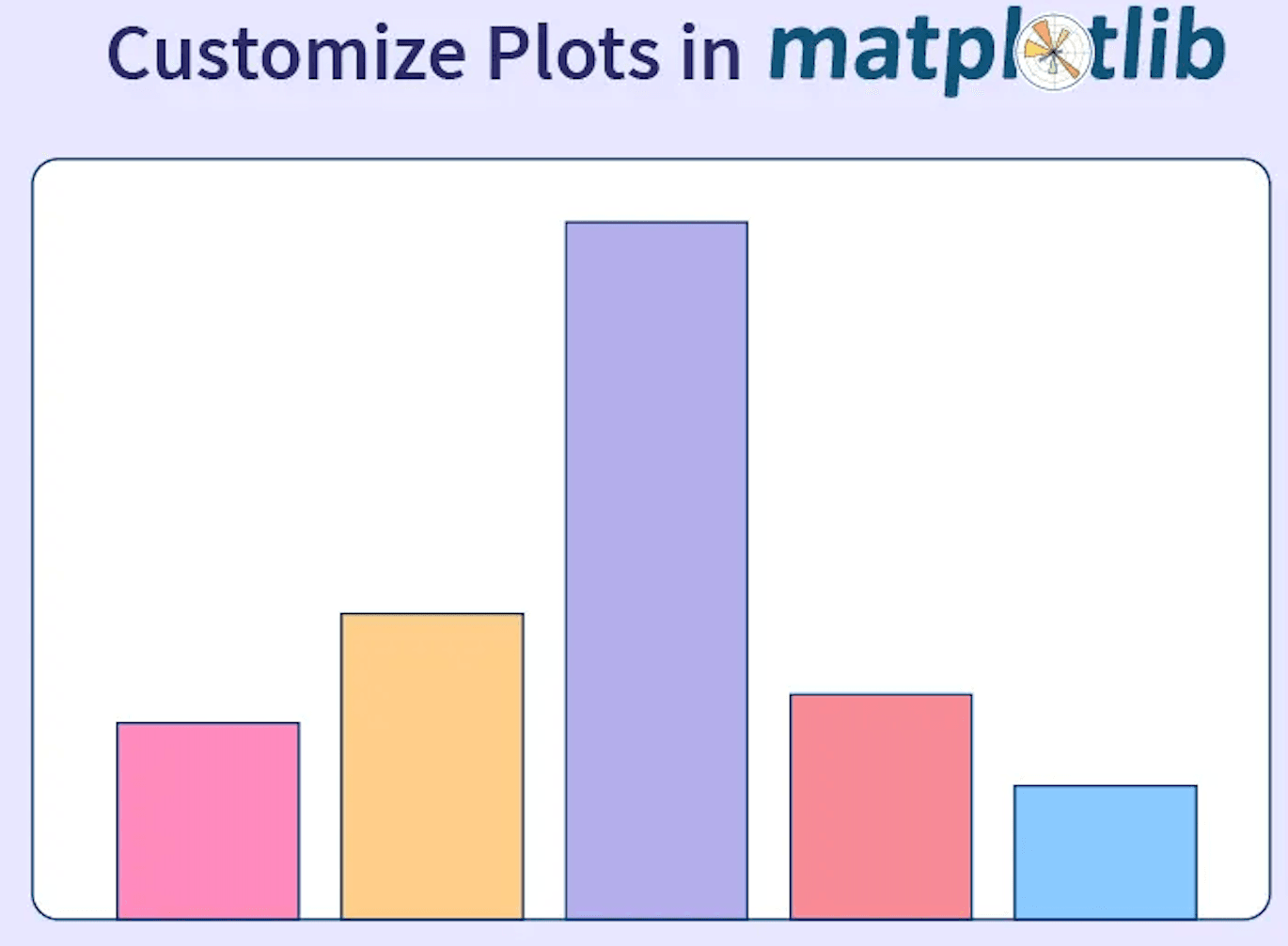
Customization Options:
Customize plots using Matplotlib
Matplotlib provides many customization options that allow you to tailor the visualizations to your specific needs. Here are some of the key features:
- Colors: You can customize the color of the plots using color codes, predefined color names, or RGB values. For example, plt.plot(x, y, color='red') sets the color of the line to red.
- Line Style: You can customize the style of the lines using various options like solid, dashed, dotted, or dash-dot. For example, plt.plot(x, y, linestyle='- -') sets the line style to dashed.
- Marker Style: You can customize the markers used in a scatter plot using various options like circles, squares, or triangles. For example, plt.scatter(x, y, marker='o') sets the marker style to circles.
- Size: You can customize the size of the plots using various options like font size, marker size, or figure size. For example, plt.scatter(x, y, s=50) sets the size of the markers to 50.
- Legends: You can add legends to the plots to provide context for the data points. For example, plt.legend(['data'], loc='upper left') adds a legend with the label 'data' at the top left corner of the plot.
- Annotations: You can add annotations to the plots to highlight specific data points or features. For example, plt.annotate('peak', xy=(10,20), xytext=(5, 25), arrowprops=dict(facecolor='black', shrink=0.05)) adds an annotation with the label 'peak' at the point (10, 20) with an arrow pointing to (5, 25).
- Axis and Grid: You can customize the axis and grid using various options like tick labels, tick positions, and axis limits. For example, plt.xlim(0, 10) sets the limits of the x-axis to be between 0 and 10.
Advanced Visualizations:
Matplotlib visualization
In addition to the basic visualizations we discussed earlier, Matplotlib provides several advanced visualization options. Here are some examples:
- Heatmap: A heatmap is used to display data in a matrix format with color-coded cells representing the values. It is useful for visualizing relationships between two variables. In Matplotlib, we can create a heatmap using the imshow() function.
- Box Plot: A box plot is useful while displaying the distribution of a continuous variable. It shows the median, quartiles, and outliers of the data. In Matplotlib, we can create a box plot using the boxplot() function.
- Violin Plot: A violin plot is similar to a box plot, but it also shows the density of the data at different values. In Matplotlib, we can create a violin plot using the violinplot() function.
- 3D Plot: A 3D plot is used to display data in a three-dimensional space. It is useful for visualizing relationships between three variables. In Matplotlib, we can create a 3D plot using the plot_surface() function.
Difference Between Matplotlib and Other Methods
Matplotlib VS Other methods
Matplotlib is one of the most popularly used data visualization libraries in Python, but there are other methods available for creating visualizations as well. Here are some differences between Matplotlib and other methods:
- Matplotlib vs. Seaborn: Seaborn is another data visualization library in Python that is built on top of Matplotlib. Seaborn provides a higher-level interface that simplifies the process of creating statistical visualizations, such as heatmaps, bar plots, and violin plots. It also provides default styles and color palettes that can make your visualizations look more polished. Matplotlib, on the other hand, provides a lower-level interface that gives you more control over the details of your visualizations.
- Matplotlib vs. Plotly: Plotly is a web-based data visualization library that allows you to create interactive plots and dashboards. It provides a variety of charts and plots, including scatter plots, line charts, bar charts, and heatmaps, as well as more advanced visualizations like 3D plots and network graphs. Unlike Matplotlib, Plotly allows you to create interactive visualizations that can be embedded in web applications and shared online.
- Matplotlib vs. ggplot: ggplot is a data visualization library in Python that is based on the popular R package of the same name. It provides a similar interface to the R version of ggplot, which allows you to create visualizations using a declarative syntax. ggplot provides a more streamlined approach to creating visualizations than Matplotlib, but it may not offer as much flexibility or customization options.
- Matplotlib vs. Excel: Excel is a widely used spreadsheet software that includes a variety of data visualization tools. It allows you to create charts and graphs using a simple interface, and it provides a wide range of chart types, including line charts, bar charts, and pie charts. However, Excel's visualization capabilities may be limited compared to Matplotlib, and it may not be suitable for handling large or complex datasets.
Conclusion
In this blog, we saw some of the basic visualizations that can be created using Matplotlib in Python. With Matplotlib, you can create a wide range of visualizations, from simple line charts to complex heatmaps. These visualizations can be used to explore data, communicate insights, and make better decisions.


