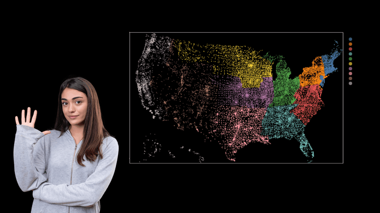
Each library has its own strengths and weaknesses, so it is important to choose the right one for your specific needs. We will also provide examples of how to use each library to create different types of plots.
- Matplotlib
Matplotlib is the oldest and most widely used Python data visualization library. Despite being over a decade old, it is still the most popular library for plotting in the Python community. Matplotlib was designed to closely resemble MATLAB, a proprietary programming language developed in the 1980s.
Matplotlib is one of the most popular Python data visualization libraries. It is built on top of the NumPy library and allows you to access a number of NumPy’s methods with less code. Other libraries like pandas and Seaborn are also built on top of Matplotlib and are designed to work in tandem with it during analysis.
Though Matplotlib is not the best tool for creating publication-quality charts, it is still useful for getting a sense of the data. Along with the incredible power of Matplotlib comes complexity.
For many years, Matplotlib has received criticism for its outdated default styles. The style is still present in the most recent release, Matplotlib 3.5.3.
Here is the practical implementation:


- Seaborn
Seaborn is a Python data visualization library built on Matplotlib. It provides a high-level interface for creating visually appealing and informative statistical graphics.
Seaborn shares the underlying architecture of Matplotlib. This means that if you know Matplotlib, you can probably get by with Seaborn. However, Seaborn’s default styles and color palettes are designed to be more aesthetically pleasing and modern. So, if you want your charts to look their best, you will need to be familiar with Seaborn.
Here is the practical implementation:


- Plotnine (ggplot2)
Plotnine is a visualization package that allows you to layer different components to create a complete plot. For example, you could begin with axes, then add points, then a line, a trendline, and so on. Plotnine is a functional port of ggplot2. R programmers familiar with ggplot2 will find it simple to use.
Plotnine is best used with data stored in a DataFrame. This is because Plotnine is tightly integrated with pandas, making it easy to use the data in your DataFrame.
Here is the practical implementation:


- Bokeh
Bokeh is a powerful Python library that helps you create interactive, web-ready plots. Its key strength is the ability to produce interactive, web-ready plots that can be quickly output as JSON objects, HTML documents, or interactive web applications. Bokeh also supports streaming and real-time data.
To accommodate different user types, Bokeh offers three interfaces with varying levels of control. The highest level is for quickly creating charts. It contains methods for creating common charts like bar plots, box plots, and histograms. The middle level is similar to Matplotlib in that it allows you to control the basic building blocks of each chart. The most basic level is intended for developers and software engineers. It has no predefined defaults and requires you to define each chart element.
Here is the practical implementation:


- Pygal
Pygal is a Python plotting library that offers interactive plots that can be embedded in a web browser. Its main differentiator is its ability to output charts as SVGs. This is advantageous for smaller datasets; however, for larger datasets with hundreds of thousands of data points, SVGs can become sluggish.
If you want to create a good-looking chart, it’s easy to do so with a few lines of code by using one of the many built-in chart types.
Here is the practical implementation:


So, which Python data visualization library is right for you? It depends on your specific needs and preferences. If you are looking for a powerful and flexible library that can handle large amounts of data, then Matplotlib is a good choice. If you are looking for a library that is specifically designed for creating interactive visualizations, then Bokeh is a good option.
Whatever your needs, there is a Python data visualization library that can help you to improve your insights.
If you are interested in mastering Python programming and becoming a coveted Data Scientist, sign up for AlmaBetter’s Full Stack Data Science program today and unlock a world of opportunities.
Read our recent blog on “Everything you need to know about Deepchecks”.


