


In today's data-driven world, mastering data visualization is crucial for effective data communication. Tableau, a leading data visualization tool, offers powerful and intuitive features for creating insightful visualizations. This article explores the essentials of Tableau data visualization, providing key insights for both beginners and experienced users.
Understanding the Basics of Tableau Data Visualization
What is data visualization in Tableau? Tableau transforms complex data sets into understandable visual formats, making data analysis accessible to everyone. Whether you're dealing with small datasets or big data, Tableau's user-friendly interface allows you to create compelling visualizations effortlessly. Key features include drag-and-drop functionality and a wide range of chart types, making it a preferred choice for data visualization projects using Tableau.
- The Power of Visual Analytics: Visual analytics in Tableau enables users to explore and interpret data interactively. This interactive approach to data analysis not only saves time but also unveils hidden insights.
- Connecting to Various Data Sources: One of Tableau's strengths is its ability to connect seamlessly with various data sources, including cloud-based data, spreadsheets, and SQL databases.
- Customization and Flexibility: Tableau provides extensive customization options, allowing users to tailor their visualizations to meet specific needs.
Getting Started with Tableau
Step 1: Setting Up Tableau
Begin by acquiring Tableau Desktop from the Tableau official website and install it on your computer. After installation, open Tableau to start exploring the world of data visualization.
Step 2: Data Source Integration
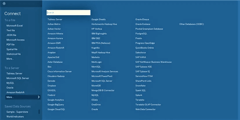
Tableau is compatible with a wide range of data sources, including spreadsheets, databases, and various cloud solutions. To get started, try connecting to a practice dataset:
- Select “Connect to Data”.
- Pick your preferred data source, like Excel, CSV, or a specific database.
- Complete the process by loading your selected data into Tableau.
Step 3: Data Familiarization
Upon loading your data, Tableau will showcase it in the Data Source tab. This is where you can examine the structure of your data and get a preview of the entries. Take some time to understand the nature of your data and the insights it may offer.
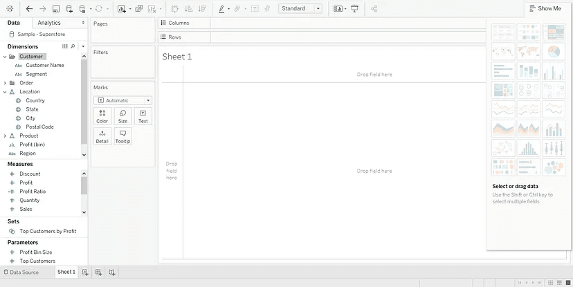
Step 4: Crafting a Worksheet
Translate your data into a visualization:
- Navigate to the “Worksheet” tab.
- In the sidebar, you'll find Dimensions and Measures. Drag a dimension such as “Category” to the Rows area.
- Then, bring a measure like “Sales” to the Columns area.
- Tableau will intuitively generate a bar chart based on your selections.
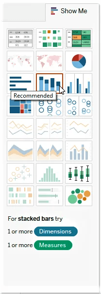
Step 5: Personalizing Your Visuals
Tableau offers a variety of options to tailor your visualizations:
- For different chart types, use the “Show Me” panel.
- Implement “Filters” shelf to add filters.
- Utilize “Format” choices for further customization of your visualization.
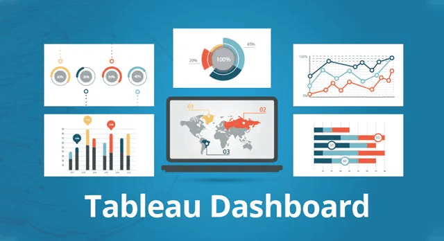
Step 6: Building Dashboards
Dashboards are great for displaying multiple visualizations together:
- Click on the “Dashboard” tab.
- Drag and position your sheets onto the dashboard.
- Adjust their arrangement and sizing as necessary.
Step 7: Enhancing Interactivity
One of Tableau’s strengths is its interactive dashboards. To incorporate interactive elements:
- Implement features like quick filters, parameter controls, or actions.
- As an example, you might add a filter for users to select a particular time frame.
Step 8: Sharing Your Creations
Once you’re content with your visualization, you can distribute it:
- Choose “Server” followed by “Publish Workbook.”
- Log into your Tableau Server or Tableau Online account.
- Configure the access permissions and proceed to publish.
Advanced Techniques in Tableau Data Visualization
To further your skills in data visualization and communication with Tableau, it's important to delve into its advanced features. These include calculated fields, parameter controls, and interactive dashboards.
- Creating Dynamic Dashboards: Interactive dashboards in Tableau allow users to explore data from multiple angles. These dashboards can be customized to include filters, actions, and tool tips, enhancing the user experience.
- Leveraging Calculated Fields: Calculated fields in Tableau offer the flexibility to create custom metrics and dimensions, enhancing the depth of analysis.
- Data Blending and Joining: Tableau's data blending and joining capabilities enable users to combine data from different sources, providing a comprehensive view of the data.
- Animations in Tableau: Utilize Tableau's animation capabilities to create dynamic visualizations that change over time, making it easier to understand changes in the data.
Real-World Applications and Case Studies
Tableau data visualization examples span various industries, from healthcare to finance. These real-world applications demonstrate the data visualization tool's versatility and impact.
- Healthcare Data Analysis: In healthcare, Tableau is used to visualize patient data, treatment outcomes, and resource allocation, aiding in better decision-making.
- Financial Reporting: In finance, Tableau helps create detailed financial reports and dashboards, offering insights into market trends and investment opportunities.
- Retail and Sales Analysis: Retail companies use Tableau for sales analysis, customer segmentation, and inventory management, optimizing their operations and strategies.
Conclusion
Mastering data visualization in Tableau opens up a world of possibilities for data analysis and communication. By leveraging Tableau's capabilities, you can transform raw data into meaningful stories and make data-driven decisions with confidence. Whether you are working on data visualization projects using Tableau or exploring its potential, the journey toward mastering Tableau is both rewarding and insightful.


