
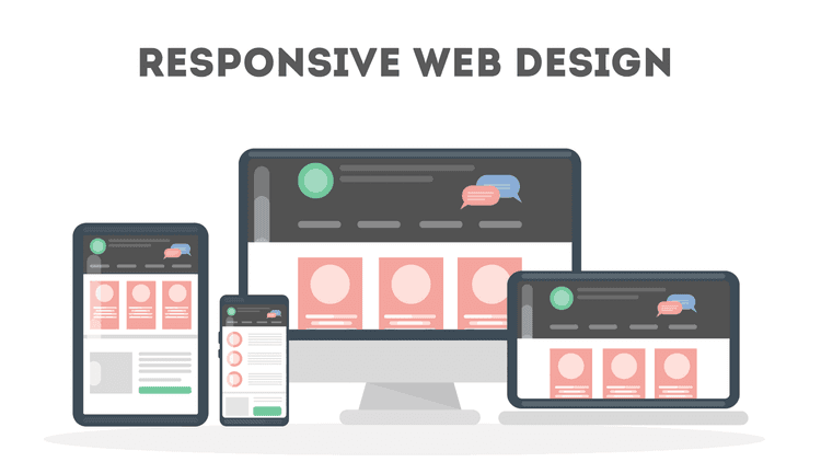


The internet is like a second home for most of the population in 2023. Moreover, at the same time, businesses are going online as people prefer access to everything at their fingertips. From online shopping to streaming videos, the internet has changed everything. With the internet being accessed from billions of mobile devices, it is vital to understand the basics of responsive Web Design to build a static website and an interactive homepage for both computers and mobile devices.

Moreover, other devices, such as tablets, smartphones with different dimensions, and 2-in- laptops, are popular choices and must be considered when designing a design. By understanding the basics of Web Design, you can build the perfect website for every kind of device. Ultimately, improvements in user experience result in higher conversion rates and business growth.
This blog will walk you through the basics of responsive Web Design with valuable tips and tricks and the best examples.
The basics of responsive Web Design
This section will discuss the basics of Web Design and the skills and tools required to build a user-friendly and interactive website for different audiences and devices.
a. HTML & CSS
HTML and CSS are the foundation of responsive Web Design. These two languages are entirely responsible and control the content & layout of a page in any web browser.
HTML controls the elements, structure, and content of the page. Moreover, HTML is also used to play with primary attributes such as height and width.
On the other hand, Web Developers prefer CSS to edit the layout and design of the elements included on a page with HTML. Developers combine CSS with a technique called Media Query to make a Web Design more responsive and faster.
b. Media query
A media query is an essential part of CSS3 that allows you to render content to adapt to various factors such as resolution & screen size.
Skilled Web Developers usually take the “mobile first” approach, where they can define what they want on a mobile device and then scale up from there. It works similarly to an “if clause” in a few programming languages.
c. Fluid layout
In earlier days, publishers used to determine the size of what was displayed in pre-defined measures. However, this trend continued when the internet took over the world, and designers represented websites in pixel sizes.
Fluid layout plays a vital role in the modern responsive design era. As mentioned above, there was a static value for every HTML element. However, in today’s world, designers use a fluid layout that relies on dynamic values like the percentage of the viewport width. This dynamic approach helps increase and decrease container element sizes based on various screen sizes.
d. Responsive images
Responsive images grab users’ attention as they are essential to any web page or application. Like the fluid layout, the primary iteration of responsive images also uses the same concept to control the width or height.
Furthermore, you must use the HTML srcset attribute in your IMG tag to serve different versions scaled for different devices.
e. Speed
The loading speed of a website should be a top priority when you work on Web Design. As long as you understand and implement the basics of Web Design, you will be able to build a fast and responsive website.
According to research, pages that load under 2 seconds have an average bounce rate of 9%.
On the other hand, pages that take around 5 seconds lead to a 38% bounce rate.
There are several ways to design your pages faster. For Example, implementing caching, image optimization, minification, and using a more efficient CSS layout.
Responsive Web Design Examples
a. Amazon
Amazon is the most prominent E-commerce organization for several reasons. One of them is their interactive user interface which is also perfectly fluid across all devices.
Their tablet layout is perfect, as they removed the scrollable section and some of the white spaces to fit more content in a smaller space. Similarly, their mobile layout focuses only on the essentials and the recent purchase history.

b. LinkedIn
LinkedIn is among the top platform used by professionals across the globe. One of the main reasons is its fast and responsive user interface across multiple devices.
The website focuses on providing all the information on the home page itself, including your feed, trending topics, and profile information. The mobile layout focuses solely on your feed and relevant information.

Conclusion
Several elements help create responsive Web Design. First, the chances of making mistakes will be minimal if you understand and learn the basics of Web Design.
We have summarized all the tips and tricks with the best examples in this blog. You can build a responsive website by practicing and following the tips and tricks mentioned above. However, if you want a platform that provides structured learning and guidance, check out AlmaBetter’s Full Stack Web Development course and learn from industry experts.


 in Bengaluru, India
 in Bengaluru, India