Your Success, Our Mission!
6000+ Careers Transformed.
Every successful machine learning project begins with clean, well-understood data — and recommendation systems are no exception. In this lesson, we use the MovieLens dataset, one of the most popular benchmarks for building and evaluating recommenders. It contains millions of ratings from users across thousands of movies, along with metadata such as genres, titles, and timestamps.
The first step involves loading and merging datasets, such as ratings.csv, movies.csv, and tags.csv. After combining them using userId and movieId, we explore key statistics — average rating per user, most-rated movies, and rating distribution. Visualizations like histograms and boxplots help us understand user behavior and detect potential biases (for example, users who rate too few movies or movies with abnormally high ratings).
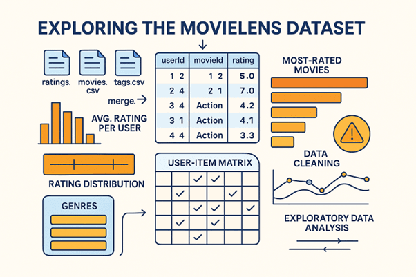
Next, we perform data cleaning and preprocessing. Missing or inconsistent data is handled by imputation or removal. Categorical columns like “genres” are split into lists or one-hot encoded for model compatibility. We may also create a User-Item Matrix, a foundational structure where each row represents a user, each column a movie, and the cell value the corresponding rating.
Finally, exploratory data analysis (EDA) provides valuable insights into trends — such as how ratings vary by genre or popularity. This stage not only ensures that the dataset is clean and balanced but also informs feature engineering decisions later. By the end of this lesson, we have a refined dataset ready for modeling — the first essential step in building a robust recommender system.
Once preprocessing is complete, the next step is to construct and evaluate recommendation models. We begin with baseline models such as Content-Based Filtering using TF-IDF and Cosine Similarity. These models recommend movies with similar metadata (e.g., genre or description) to what a user already liked. Next, we move to Collaborative Filtering, where algorithms learn from user behavior. This includes both User-Based and Item-Based approaches, as well as Matrix Factorization techniques like Singular Value Decomposition (SVD).
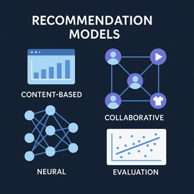
For deeper insights, we can incorporate Neural Collaborative Filtering (NCF), which learns complex user–item relationships through embeddings and deep layers. Training these models involves minimizing errors between predicted and actual ratings, typically using metrics like RMSE (Root Mean Squared Error) and MAE (Mean Absolute Error). We may also calculate Precision@K and Recall@K to evaluate the ranking quality of recommendations — determining how well the model retrieves relevant movies within the top-K suggestions.
Cross-validation techniques help prevent overfitting and ensure generalization. Once we’ve tested multiple models, we select the one that balances accuracy, scalability, and interpretability. Visualization plays a key role here — plotting learning curves, error distributions, and top-N recommendation lists per user.
A great recommendation model is only valuable when its insights are accessible and interactive. In this lesson, we focus on designing an intuitive user interface (UI) that allows users to experience personalized recommendations in real time. Using Streamlit, Plotly, or Dash, we can build an interactive dashboard to visualize both system performance and recommendations.
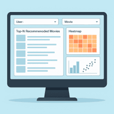
The dashboard typically includes user input options — such as a dropdown to select a user ID or search for a movie — and displays top-N recommended movies with their predicted ratings or similarity scores. Supporting visualizations like bar charts, heatmaps, and scatterplots help users understand their behavior patterns and how the system arrives at certain suggestions. For instance, a heatmap can show which genres a user interacts with most, while a similarity plot can display related movies in a two-dimensional embedding space.
Beyond visualization, the UI connects to backend models through APIs or local functions. The system retrieves recommendations dynamically, creating a seamless experience between data, model, and presentation. The design should prioritize clarity, interactivity, and responsiveness, ensuring that both technical and non-technical users can explore results effortlessly.
Top Tutorials

Python
Python is a popular and versatile programming language used for a wide variety of tasks, including web development, data analysis, artificial intelligence, and more.

SQL
The SQL for Beginners Tutorial is a concise and easy-to-follow guide designed for individuals new to Structured Query Language (SQL). It covers the fundamentals of SQL, a powerful programming language used for managing relational databases. The tutorial introduces key concepts such as creating, retrieving, updating, and deleting data in a database using SQL queries.

Data Science
Learn Data Science for free with our data science tutorial. Explore essential skills, tools, and techniques to master Data Science and kickstart your career
All Courses (6)
Master's Degree (2)
Fellowship (2)
Certifications (2)


