Your Success, Our Mission!
6000+ Careers Transformed.
In the realm of machine learning, visualizing and analyzing model performance is essential for understanding how well our models are performing and gaining valuable insights into their behaviour. By employing suitable visualization techniques and analyzing performance metrics, we can uncover strengths and weaknesses, track performance over time, interpret feature importance, and much more. In this article, we will explore the significance of visualizing and analyzing model performance, along with various techniques and tools that can aid in this process.
Visualizing and analyzing model performance allows us to go beyond mere numerical metrics and gain a comprehensive understanding of how well our models are functioning. These techniques provide intuitive insights into the strengths and weaknesses of our models, enabling us to make informed decisions and take appropriate actions. By visualizing and analyzing model performance, we can identify patterns, detect anomalies, track trends, and validate the effectiveness of our models.
Selecting appropriate performance metrics is crucial for evaluating model performance accurately. We need to consider the specific problem we are solving and the objectives we aim to achieve. Metrics such as accuracy, precision, recall, F1 score, and others provide quantitative measures of performance. By choosing the right metrics, we can align our evaluation with the desired outcomes and make informed decisions about model improvements.
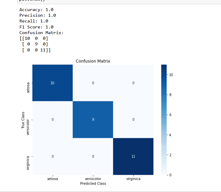
Visualization techniques play a vital role in understanding and communicating model performance. Confusion matrices, ROC curves, and precision-recall curves are commonly used visualizations that provide insights into model behavior. Confusion matrices help us understand the distribution of correct and incorrect predictions, while ROC and precision-recall curves help us evaluate model performance across different thresholds. Through effective visualizations, we can gain a deeper understanding of how our models are performing and make informed decisions.
Monitoring model performance over time is crucial for identifying trends and detecting any degradation or improvement in performance. By visualizing performance trends using line charts or time-series analysis, we can spot patterns, seasonality, or other temporal dependencies that may impact model performance. This allows us to take proactive measures to maintain and enhance model effectiveness.
Understanding the importance of features in model predictions is vital for gaining insights and making informed decisions. Visualization techniques such as feature importance plots, permutation importance, or SHAP (Shapley Additive Explanations) values can help us interpret and visualize the impact of different features on model predictions. This knowledge enables us to refine our models, focus on relevant features, and improve overall performance.
Examining prediction errors and residuals provides valuable insights into model performance. Visualizations such as scatter plots, residual plots, or error distribution histograms help us understand the patterns and distribution of errors made by our models. By analyzing these visualizations, we can identify specific areas where our models struggle, identify outliers or anomalies, and make targeted improvements.
A/B testing and experimental analysis are powerful techniques for comparing different model variants or testing the impact of changes. By employing visualizations such as bar charts, box plots, or hypothesis testing, we can effectively compare and analyze the performance of different models or experimental setups. These visualizations help us make data-driven decisions about model selection, optimization, or feature engineering.
Creating well-designed dashboards is crucial for effectively monitoring model performance. Key performance indicators (KPIs), summary metrics, and real-time visualizations can be integrated into interactive dashboards. These dashboards provide a holistic view of model performance, enabling us to monitor multiple models or experimental setups in a concise and actionable manner. By designing visually appealing and user-friendly dashboards, we can easily track performance, detect anomalies, and make informed decisions in real-time.
Interactive visualizations and tools offer a dynamic and exploratory way to analyze model performance. Platforms such as Tableau, Plotly, or D3.js provide interactive capabilities that allow users to drill down into the data, change parameters, and gain deeper insights. By leveraging these tools, we can create interactive visualizations that enable stakeholders to interact with the data and uncover hidden patterns or trends.
Python code demo that demonstrates how to calculate and evaluate the performance metrics using scikit-learn library for a classification task on an example dataset:
**load_iris** from **sklearn.datasets** to load the Iris dataset, **train_test_split** from **sklearn.model_selection** to split the data into training and testing sets, **accuracy_score**, **precision_score**, **recall_score**, **f1_score**, and **confusion_matrix** from **sklearn.metrics** for evaluating the model's performance, **LogisticRegression** from **sklearn.linear_model** to train a logistic regression model, and **matplotlib.pyplot** and **seaborn** for visualization.**load_iris()**. This dataset contains features (X) and target labels (y).**train_test_split()**, where 80% of the data is used for training (**X_train** and **y_train**) and 20% is used for testing (**X_test** and **y_test**).**LogisticRegression** model and train it using the training data by calling **fit(X_train, y_train)**.**model.predict(X_test)** and store the predictions in **y_pred**.**y_test**) and the predicted labels (**y_pred**).**confusion_matrix(y_test, y_pred)**, which provides a tabular representation of predicted versus true labels.**plt.figure()** and set the size. Then, we use **sns.heatmap()** to create a heatmap of the confusion matrix with annotations, specifying the colormap (**cmap**), format of the cell values (**fmt**), and labels for the x-axis and y-axis ticks.**plt.title()**, and label the x-axis and y-axis using **plt.xlabel()** and **plt.ylabel()**.**plt.show()**.This code allows you to train a model, make predictions, and evaluate its performance using various metrics. It also provides a visual representation of the confusion matrix to gain insights into the model's classification results.
In conclusion, visualizing and analyzing model performance is crucial for gaining insights into the behavior of machine learning models. By employing suitable visualization techniques and calculating performance metrics, we can assess the strengths and weaknesses of our models, track their performance over time, and make informed decisions. Visualizations such as confusion matrices, ROC curves, and feature importance plots provide intuitive ways to understand model behavior. Furthermore, by leveraging interactive tools and designing effective dashboards, we can effectively monitor and communicate model performance. Through these practices, we can optimize our models, enhance their effectiveness, and drive success in our machine learning endeavors.
1. What is the purpose of visualizing and analyzing model performance?
a) To confuse stakeholders
b) To gain insights and understand model behavior
c) To complicate the evaluation process
d) To ignore the performance metrics
Answer: b) To gain insights and understand model behavior
2. Which metric balances precision and recall in model evaluation?
a) Accuracy
b) F1 Score
c) Recall
d) Precision
Answer: b) F1 Score
3, What does a confusion matrix visualize?
a) Distribution of correct and incorrect predictions
b) Feature importance
c) ROC curve
d) Model accuracy
Answer: a) Distribution of correct and incorrect predictions
4. Why is monitoring model performance over time important?
a) It adds unnecessary complexity to the evaluation process
b) It helps identify trends and detect changes in performance
c) It has no impact on model improvement
d) It only applies to specific types of models
Answer: b) It helps identify trends and detect changes in performance
Top Tutorials

Python
Python is a popular and versatile programming language used for a wide variety of tasks, including web development, data analysis, artificial intelligence, and more.

SQL
The SQL for Beginners Tutorial is a concise and easy-to-follow guide designed for individuals new to Structured Query Language (SQL). It covers the fundamentals of SQL, a powerful programming language used for managing relational databases. The tutorial introduces key concepts such as creating, retrieving, updating, and deleting data in a database using SQL queries.

Data Science
Learn Data Science for free with our data science tutorial. Explore essential skills, tools, and techniques to master Data Science and kickstart your career
All Courses (6)
Master's Degree (2)
Fellowship (2)
Certifications (2)


